Designing a white-label mobile app
Caterings is an e-commerce platform that provides everything diet catering businesses need to create and run an online store — from customer service to logistics, analytics, and a customizable, white-label storefront.
I designed a new native mobile app for Caterings’ customers, bringing the core ordering and order-management experience from web to mobile while using the opportunity to rethink workflows that had accumulated UX debt over time.
GOAL
Creating a strong digital channel for customer growth
The overarching business goal was to help Caterings’ clients grow and maximize their digital potential.
At the product level, the goal was to make ordering and managing diets faster, clearer, and more convenient on mobile, while maintaining the familiarity of the existing web experience.
MY RESPONSIBILITIES
Mobile app design
Design system
Team
1x Designer (me)
2x Developers
Timeline
5 months


CHALLENGES
Balancing a better experience with an established ecosystem
UX debt of the web platform
The existing web platform came with established patterns that users already knew, but also years of accumulated UX debt. Some workflows were confusing, unnecessarily long, or simply not designed with mobile in mind.
We also had to work within existing backend capabilities and product logic, meaning not every ideal solution was technically feasible. The challenge was to improve the experience without changing the underlying system or creating unfamiliar patterns for existing users.
Designing for a highly customizable product
Caterings powers white-label storefronts, so the app needed to work across multiple different brands, each with its own visual identity. The design system had to be flexible enough to support different branding while remaining consistent and scalable.
my PROCESS
Designing around real customer friction
01 AUDITING EXISTING USER PAIN POINTS
I started by reviewing Jira tickets related to ordering and order management and talking to the Customer Success team to understand recurring user complaints and pain points. This helped identify areas where the mobile app could deliver the biggest improvement.
02 DESIGNING THE APP
I then designed several key screens to establish the visual direction before building a scalable design system using Figma variables. The system was structured to accommodate multiple brands and both light and dark themes.
03 USABILITY TESTING
Design and development happened in parallel, flow by flow. Because of the tight deadline, there was no opportunity to run a broader MVP usability study. Instead, we relied on internal testing within the Caterings team and continuous feedback from catering businesses throughout development.

SOLUTION
A mobile-first rethink of the core experience
The result was a native mobile experience that improved the existing UX while introducing a more focused, mobile-first way of interacting with the product.
Shorter ordering flow
I reduced the diet configuration process from 6 to 3 steps by consolidating customer and delivery information into the final Summary & Payment step.
A clearer order summary
The redesigned summary gives users a much better understanding of what they're actually ordering. They can move from a high-level overview to a detailed breakdown of meals for each day, making it easier to verify their order before payment.
Faster order management
Users can easily switch between an overview of all their orders to a specific diet. From the diet view, they can immediately access actions such as changing delivery dates or editing diet parameters.
This brings frequently needed actions closer to the context where users need them.
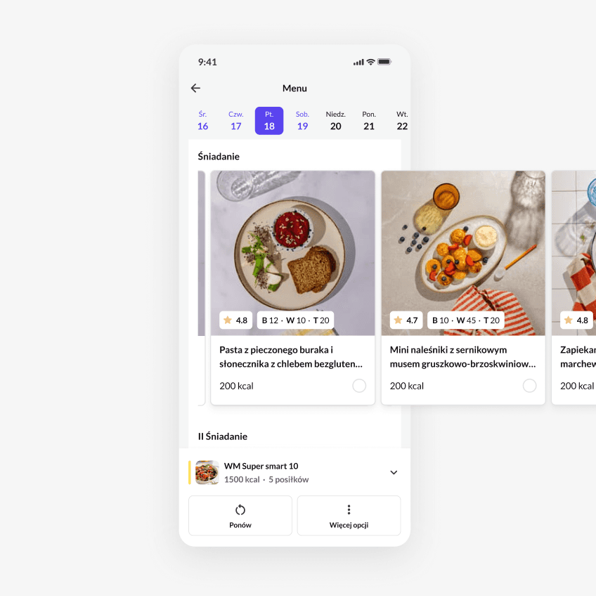
More efortless and visual way to select menu
Cards with large photos surface the information users need to make a choice, while horizontal scrolling keeps the experience compact on mobile. Additional details are available in a modal that opens on tapping the card.
As a result, users can quickly scan their options without losing the ability to dive deeper when something catches their attention.